16 Best Neutral Mid-tone Paint Colors Designers Love
As a homeowner, choosing the right paint colors for your home can be a daunting task. One of the most important aspects of painting your walls is selecting the best midtone paint colors. Mid-tone colors can add warmth, depth, and personality to your home. In this blog post, we’ll take a look at the best midtone paint colors that will transform your living space.

What are Midtone Paint Colors?
For years, designers and homeowners have been going the light and airy route and painting almost every room a shade of white or tan, or light gray. While I have loved neutral colors and the “light and airy” trend, I’ve recently been seeing an influx of designers picking mid-tone paint colors and Y’ALL. I love it.
Midtone paint colors are colors that fall in the middle of the spectrum between light and dark. They are not too light and not too dark and typically have a medium level of saturation. Midtone colors can add depth and richness to a room, and can create a sense of balance and harmony when used in combination with other colors.

They are versatile and can work well in a variety of styles and settings, from traditional to modern. Some popular midtone paint colors include shades of gray, beige, blue, green, and pink, but there are many other options to choose from.
When selecting the best midtone paint colors, it’s important to consider the overall look and feel of the room, as well as personal preferences and style.
The Best Neutral Paint Colors for Your Home

Some popular mid-tone colors include shades of gray, beige, and greige (a combination of gray and beige). These colors can work well in a variety of styles, from modern to traditional, and can complement a wide range of furniture and décor. I personally have a LOT of mid-tone paint colors in my home and they are my favorite. They read neutral but give every room character and interest.
When choosing a mid-tone color for your home, it’s important to consider the overall style and feel of your space. Take into account the existing furniture and accessories, and choose a color that complements them. You should also consider the natural light in the room, as certain colors can appear different in different lighting conditions.
The Best Midtone Paint Color Palette
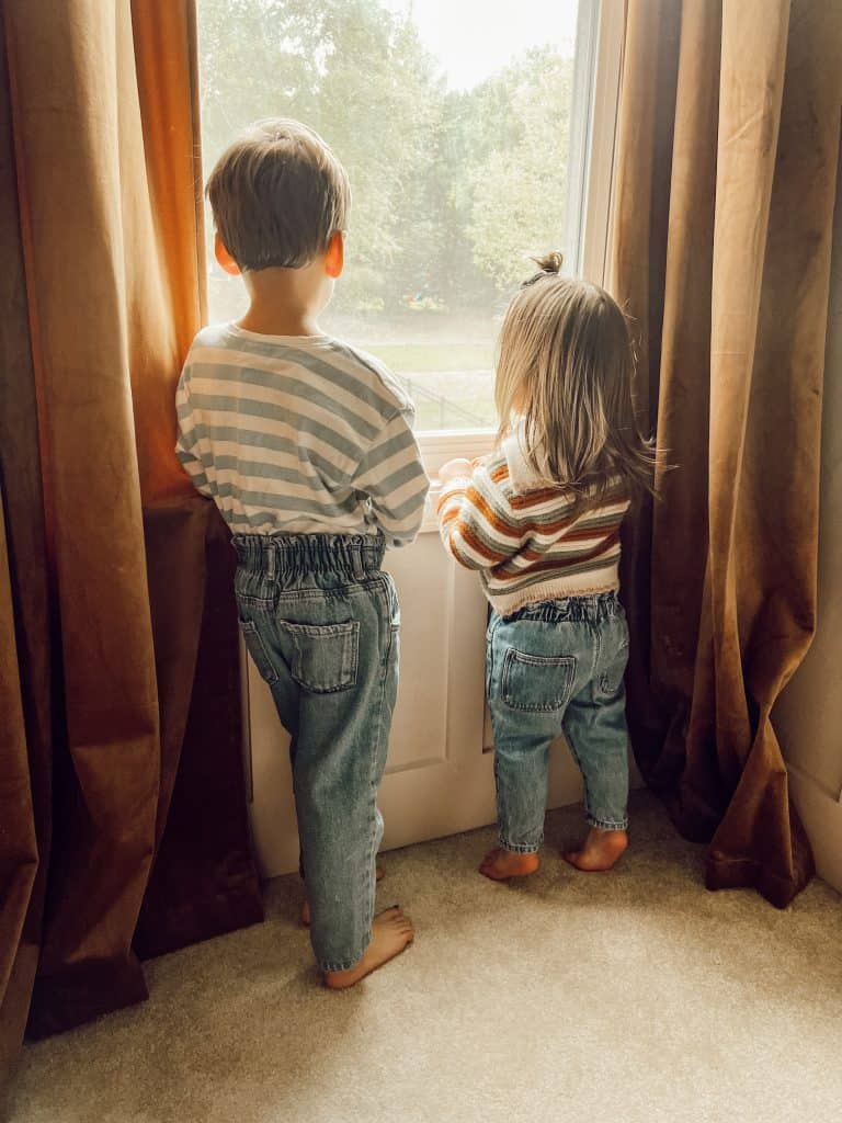
As with dark colors OR light and airy colors, it’s important to decide how you want the color of the room to read. For example, if you have tons of wood trim/furniture, tons of natural light from a window, or warm accents in the room, it might be best to choose a paint with gray undertones to balance all that warmth. Here’s an example:
If you have sleek, black furniture or just very neutral furniture and accents, I recommend selecting a paint with warm tones. Yellow undertones, red undertones, and paints that lean more beige than gray will really help warm up your space and bring the perfect balance to your home!
The Importance of Natural Light

When choosing the best midtone paint colors for a room, it’s important to consider the amount and quality of natural light that enters the space. Natural light has a significant impact on how a paint color looks and feels in a room.
For example, a color that looks bright and cheerful in a room with lots of natural light might appear dull and muted in a darker space with limited light. Similarly, a warm color might feel too intense and overwhelming in a room that gets a lot of direct sunlight.
I like to put a paint swatch on my wall and observe it at various times of day before I zero in on that shade. This helps make sure you have the perfect working shade, no matter the time of day!
Interior Designers Favorite Neutral Paint Colors
Here are the best midtone paint colors interior designers AND homeowners alike are obsessing over!
Revere Pewter – Benjamin Moore
If you are looking for a delightful shade in the family of “warm grays”, you’ll LOVE Revere Pewter. Revere Pewter is a classic midtone color that has been popular for years.
It’s a beautiful light gray with warm undertones that can complement any décor style. This versatile color can be used in any room, from the living room to the bedroom. It pairs well with warm and cool colors, making it a great choice for those who want to create a balanced look.
Dead Salmon – Farrow and Ball

The perfect neutral paint color doesn’t exist… Until you see Dead Salmon by Farrow and Ball.
This midtone pink color has a warm undertone that can add a touch of sophistication to any room. It pairs well with other warm colors, such as beige or gold, and can work well in a traditional or eclectic space.
I’ve been dying to try this paint color and finally had the oppurtunity when we started renovating our dining room space. My husband was afraid it would read too pink but it really doesn’t! It truly is the best versatile neutral shade. It gives a ton of character but also goes well with a variety of different colors.
Farrow and Ball has SO many great paint shades. If you love this one, check out all their paint products HERE!
Sage Green Light – Sherwin Williams
This midtone green color has a soft, muted quality that can add a calming and serene feel to a room. It works well with other natural tones, such as wood or stone, and can be paired with other greens or neutrals to create a cohesive look.
After watching Valeria’s kitchen reno on Instagram, I KNEW I needed to use this color in my home somewhere. We settled on my home office space right off the front entry. I love the depth it creates to see a dark shake beyond our neutral entryway.
Sea Salt – Sherwin Williams
Sea Salt is a stunning midtone color that is perfect for those who want to add a touch of beachy vibes to their home.
It’s a pale green with blue undertones, which can create a relaxing and soothing atmosphere. This color can work well in bathrooms, bedrooms, and living rooms. It’s a versatile color that can be paired with various décor styles.
Classic Gray – Benjamin Moore
In the same color family as the uber-popular “chantilly lace” white, classic gray is a beutiful choice for a neutral mid-tone.
If you’re looking for a classic midtone color that will never go out of style, then Classic Gray by Benjamin Moore is an excellent choice. This color is a warm gray that has a slight beige undertone, making it a great neutral option for any room in your home. It’s perfect for those who want to create a cozy and inviting atmosphere.
Hale Navy – Benjamin Moore
Forget any other navy shade you were considering and go with Hale Navy.
Hale Navy is a deep blue midtone color that can add drama and sophistication to any room. This color works well in bedrooms, living rooms, and even kitchens. It pairs well with various colors, from warm neutrals to cool blues and greens. If you want to create a bold statement in your home, then Hale Navy is the perfect choice.
Gentleman’s Gray – Benjamin Moore
Confused? Yes, this midtone “gray” actually reads more jewel-toned/navy. This midtone blue-gray color has a moody and sophisticated quality that can add a sense of depth and richness to any space.
It pairs well with other deep, rich colors, such as navy or black, and can work well as an accent color or as the main color in a space.
Pink Phenomenon – Behr

Probably the most asked-about paint color in our home is Charlotte’s nursery! I sampled over 14 colors before I finally settled on this very faint, mauvy pink that is the most calming and sweet color in our home.
This midtone pink color has a playful and bold quality that can add a pop of color to any space. It pairs well with other bright or pastel colors and can work well in a modern or eclectic space. Charlotte’s vintage floral nursery really loves this color as much as we love it!
Stonington Gray – Benjamin Moore
Stonington Gray is a popular midtone color that has been used in homes for years. This light gray color has blue undertones that can create a soothing and calming atmosphere in any room. It’s perfect for those who want to create a timeless and classic look in their home. This color works well with white trim and can be paired with various décor styles.
Perfect for kitchen cabinets, like the one above, I’d pair this midtone with warm accents to create a perfectly balanced look.
Agreeable Gray – Sherwin Williams
You’d have to be living under a rock to not have heard of Agreeable Gray by SW… It’s just so darn versatile and… agreeable?
Agreeable Gray is a warm gray midtone color that has become increasingly popular in recent years. This color is perfect for those who want to create a cozy and welcoming atmosphere in their home. It pairs well with warm colors, such as brown and beige, and can also be paired with cool blues and greens. This versatile color can be used in any room in your home.
Manchester Tan – Benjamin Moore
Manchester Tan is a midtone color that has warm beige undertones, making it a great neutral option for any room. It’s perfect for those who want to create a warm and inviting atmosphere in their home.
This color pairs well with warm colors, such as red and orange, and can also be paired with cool blues and greens.
Repose Gray – Sherwin Williams
Repose Gray is a popular midtone color that has a slight green undertone, making it a great option for those who want to add a touch of nature to their home.
This color is perfect for those who want to create a modern and sophisticated look in their home. It pairs well with various colors, from warm neutrals to cool blues and greens.
Edgecomb Gray – Benjamin Moore
Edgecomb Gray by Benjamin Moore is a midtone gray color that has become increasingly popular in recent years. It has a warm undertone that gives it a soft and inviting feel, and it can work well in a variety of settings and styles.
Edgecomb Gray is a versatile color that can look different depending on the lighting in the room. In natural light, it can appear warm and creamy, while in artificial light it can take on a cooler, more blue-gray tone. Overall, Edgecomb Gray is a great option for anyone looking for a versatile and timeless midtone gray paint color.
Accessible Beige – Sherwin Williams

We’ve used this in multiples places in our home and it is my go-to neutral midtone.
It reads as a bit of a “greige” although I think it leans more towards beige which is good news for me since the modern feel of gray is just not my vibe.
This mid tone beige color has a warm, inviting quality that can create a cozy and welcoming atmosphere in any room. It pairs well with other warm neutrals, such as cream or taupe, and can also work well with cooler tones, such as blue or gray.
Accessible Beige is a popular choice for those looking to update their home with a neutral and timeless color that will stand the test of time.
Olive Grove – Sherwin Williams
I am SUCH a sucker for any midtone green shade. I always graviatte towards greens on general, even for clothing. This gorgeous green is perfect for a living room, kitchen or bedroom!
This midtone olive green color has a soothing and natural quality that can create a peaceful and grounded atmosphere in any room. It pairs well with other natural tones, such as wood or stone, and can work well in both rustic and modern spaces.
Oyster Bay – Sherwin Williams
GOODNESS. If you are looking for a little bit of blue, or a beachy vibe without going overly BLUE… This midtone paint color is perfect.
This midtone blue-green color has a coastal and calming quality that can add a touch of serenity to any space. It pairs well with other natural tones, such as wood or stone, and can work well in both traditional and contemporary spaces.
FAQ About Mid-Tone Paint Colors:
What is a midtone color?
A midtone color is a color that falls in the middle of the color spectrum, between light and dark. Midtone colors can add depth, warmth, and personality to a room.
This post will help you choose the best midtone paint colors for your home!
What is considered a mid tone color?
A midtone color is considered to be a color that falls in the middle range of the color spectrum, between light and dark. It is not too light and not too dark, and typically has a medium level of saturation. The exact range of colors that are considered midtone can vary depending on the specific color space or system being used, such as RGB, CMYK, or the Munsell Color System.
Generally, midtone colors can include shades of gray, beige, blue, green, pink, and other colors that are not too light or too dark. When selecting a midtone color, it’s important to consider how it will look in relation to other colors in the space and how it will be affected by the lighting conditions in the room.
What is the most popular color for interior walls?
The most popular color for interior walls can vary depending on current trends, personal preferences, and cultural factors. However, some colors tend to be consistently popular over time.
According to a survey by Sherwin-Williams, the most popular interior wall color is white, with nearly 40% of respondents choosing it as their top choice. Other popular colors for interior walls include shades of gray, beige, blue, and green.
These colors are often chosen for their versatility, as they can work well in a variety of styles and settings. When selecting a color for interior walls, it’s important to consider factors such as lighting, furniture, and personal taste, as well as the desired atmosphere and mood of the space
What wall color goes with everything?
There is no single wall color that will go perfectly with everything, BUT there are some colors that tend to be more versatile and adaptable than others. These colors can work well with a variety of styles, furniture, and accent colors, and can create a neutral backdrop that allows other elements in the room to shine. Some of the most popular “goes with everything” wall colors include:
- White: White is a classic and timeless color that can work well in any room or style. It can create a clean and fresh look, and can be paired with any accent color or style of furniture.
- Beige: MY personal FAVE… Beige is a warm and neutral color that can create a cozy and inviting atmosphere in a room. It can work well with a variety of accent colors and styles, from traditional to modern.
- Gray: Gray is a versatile color that can range from cool and calming to warm and inviting. It can work well with other neutrals or with pops of color, and can be used in a variety of styles.
- Greige: Greige is a mix of gray and beige, and can create a warm and inviting look that works well in many styles. It can be paired with a variety of accent colors and can create a cozy and comfortable atmosphere in a room.
- Soft Blue: Soft blue is a calming and soothing color that can work well with many other colors and styles. It can create a tranquil and relaxing atmosphere in a room and can be paired with a variety of accent colors.
When selecting a wall color that goes with everything, it’s important to consider the overall look and feel of the room, as well as personal taste and style.
How do I choose the right midtone color for my home?
When choosing the best midtone paint colors for your home, it’s important to consider the overall style and décor of your space. Take into account the existing furniture and accessories and choose a color that complements them. It’s also helpful to consider the natural lighting in the room, as certain colors can appear different in different lighting conditions.
How do I test paint colors before committing to one?
Most paint stores offer small paint samples that you can take home and test on your walls before committing to a full gallon. This allows you to see how the color looks in your space and how it appears in different lighting conditions.
How many coats of paint should I apply?
Most midtone paint colors will require at least two coats for full coverage. However, depending on the quality of the paint and the color you choose, you may need to apply additional coats.
How do I properly prepare my walls before painting?
Before painting, it’s important to properly prepare your walls. This includes cleaning them thoroughly, patching any holes or cracks, and sanding down any rough areas. You should also use painter’s tape to protect trim and other areas you don’t want to get paint on.
Can midtone colors work in small rooms?
Yes, midtone colors can work well in small rooms. However, it’s important to choose a color that isn’t too dark or too bold, as this can make the room feel smaller. Lighter midtone colors, such as Revere Pewter or Stonington Gray, can work well in small rooms.
Can midtone colors be used for accent walls?
Yes, midtone colors can be used for accent walls. In fact, midtone colors can add depth and dimension to a room when used as an accent. When choosing an accent color, consider choosing a color that complements the existing wall color and décor in the room.


Love this information! Thank you for sharing! 🙂
I love that you actually listed the paint colors and gave so many examples. I love neutral tones and this post was so inspiring. Thank you!